“Calligraphy is a geometry of the soul which manifests itself physically.” —Plato
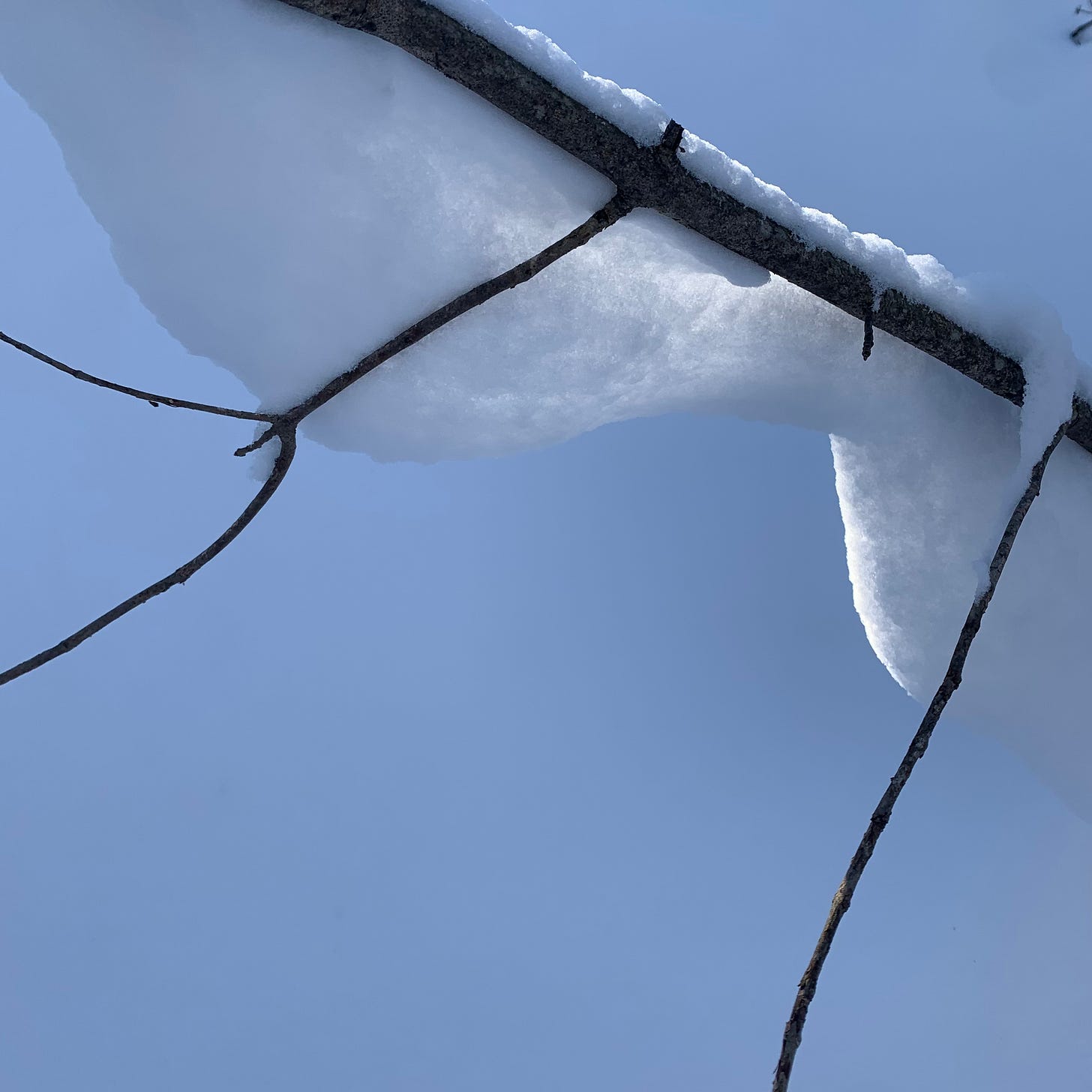
Is there any softer sound than snow falling on snow? I am off the path in a clearing in the winter woods when a clump of new snow falls from high in the trees to land on the deep snow of the forest floor. I drove a few hours north with my inkmaking kit to forage for colour along the Niagara escarpment and find myself instead blanketed in a clean, white, silent snowland. My world is simplified to the stark contrasts of of black and white and my senses are heightened. Following deer paths and my own instincts, I adjust to this new world noticing first the creaking sounds of my own boots moving through the snow and then the smell of the woods, and then its textures. The snow sets off all the different patterns of tree barks, the skeletons of Queen Anne’s lace, the lichens, thorns, vines, and an almost transparent birch leaf gliding across a sea of white. But soon the sounds and smells and textures fade from my mind and I stop trying to notice all the little details and am left only with the rhythm of walking. Of black branches and white snow.
“A letter is two shapes, one light, one dark.” says the Dutch modern master of letterforms, Gerrit Noordzij. “The black shape cannot be altered without the enclosed white shape changing and vice versa.”
I never went to school in the Netherlands, but I learned about lettering from a pre-Google European master typographer named Jean Eugene, who would not let us draw or type a single letter until we had gone through a series of exercises involving a soft pencil and hundreds of sheets of newsprint poster paper. Jean Eugene asked us to draw vertical lines without a ruler, one after another across the page until we had a line of lines, and then had us leave a space and start another set of lines to fill the entire poster-sized sheet of paper. The goal was to get the spacing between each line and then between each line of lines even and “right,” and the going was slow. Every hour or so Jean Eugene would come by to look at your lines and say, “keep going.” After five or six sheets and thousands of lines, I started to learn how to make a straight line that was repeatable. And after another few thousand more lines, I started to learn how to keep the lines between lines straight and even. After I used up a whole pad of the newsprint paper, I felt a little bit proud, like I was really learning how to make things straight. But Jean Eugene said, “keep going,” and now start to notice not the lines but the white spaces between everything, and make those even. After days of this mark making, my wrist and arm and whole body got sore and my mind would go sort of numb. After weeks of this discipline something else happened: a kind of rhythm of typography entered me. I started to feel in my own body when the line making was going astray and when it had hits its stride. I sort of fell out of time and into the pulse of the white and black. I remember walking home one day from a day of drawing lines and looking around me at all the windows of the buildings in my city and thinking, this is all typography. A rhythm of positive and negative space. After the straight pencil lines, came a set of curved and angled shapes to practice again with soft pencil on soft paper. Only after mastering these forms could we finally move on to true white paper and black ink. By the end of the course we had not even touched a computer but we understood something fundamental about the forming of letters.
I was trying to explain this Western typographical schooling, and Jean Eugene, to my friend Yuri Shimojo. I met her and her extraordinary dog Rudy in their East Village apartment a few months ago and we shared a delight in the rigour, and bodyskill, and sacramental qualities of purposeful mark-making. I told her, thirty years later, I could still feel in my arms the feeling of filling up that big sheet with lines, and she really listened. Yuri, who is the last of a samurai clan and has studied and lived with the possibilities of the line for many years, will be staring in The Colour of Ink, a documentary I am working on with Brian D. Johnson and the NFB. For the film, she draws us into the ritual of grinding ink on a stone, talks about ink as medicine, and draws a single continuous blue line over weeks with a highly-specialized ink that I developed for her.
In his seminal book The Stroke, Gerrit Noordzij says that, “Calligraphy is handwriting pursued for its own sake, dedicated to the quality of the shapes.” Maintaining the equilibrium in the white shapes,” he goes on, “makes all the difference. The white of the word is my only holdfast.”
If you have ideas about typography, or winter, or colour in the snow have a look at the comments section.
Also please spread the word about the Colour. Its still free!
Reading your description of the repetition of your lessons brought to mind the work of Agnes Martin the abstract painter who devoted her life to covering her canvases with subtle hues and zen like lines. A meditation on the line and soft color.
Thank you for sharing your stories!🙏
During long walks in winter over our farm the white landscape held a mesmerizing effect in my mind. Snow simplifies everything except what it does not cover. What remains is illuminated by the snow. It transforms shapes bringing them forward.
I created 100 plus small framed artworks all white on white with minimal colour. Marrying an object of nature with a small man made object. I sewed them onto paper I created from flax and milkweed silk. This was part of the Ontario Association of Artists provincial show in public and private galleries. I show my work at the Art Gallery of Burlington and as part of my farm installation to bring attention to the importance of water. 2004 “Water for Life”: Reflections.