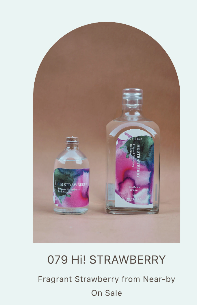
Happy Old Year’s Eve. I don’t know about you, but I feel woefully unprepared for 2023. So instead of looking forward, I am thinking back on 2022, which, like most years, was a bit of mixed bag. I didn’t forage as much as I would have liked, or go on as many adventures as the year before. I hardly made any ink for sale and most of my best experiments remain unmarketed in my basement, but I did make some work that I’m proud of. One of my favourite projects was designing handmade ink labels for a small botanical distillery in Otaki, Japan called Mitosaya founded by Hiroshi Eguchi . I love what they make and how they make it and their feelings for plants and earth, the poetry of their ingredients, and I love that Nigel Peake, one of my favourite artist-designers whose work I first saw in the titles he did for Luca Guadagnino’s We Are Who We Are, had also designed labels for them.
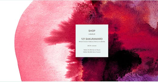
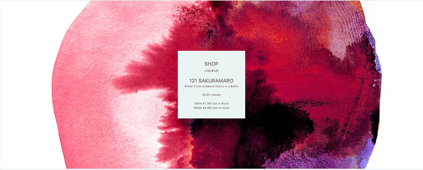
Every few months I’d send scans of artwork to to Hiroshi to suit the ingredients of their changing array of small batch spirits, and their designers would choose the artwork that worked for each new product and print it as a label. Each month their descriptions of new products also acted as a prompt for me to experiment with new ink ingredients that might meet the flavours and textures and nuances that they were inventing. What, for instance, should the label of a pumpkin liqueur look like? Orange probably, but also I wanted it to feel rich and scooped out, mysterious and earthy. What would the label for an amaro spirit called whole cherry look like? Just a cherry coloured dot wouldn’t do given that this experimental drink was based on the bark and blossoms of a particular variety of cherry and coloured with the tiny bitter darker red of another wilder cherry variety and sweetened with cherry blossom honey and mingled with a tea made from the droppings of some sort of bug that eats only cherry leaves.
You might call Mitosaya a kind of snout-to-tail or hundred-mile-diet business for spirits, and they do care deeply about the landscape and plants around them by using parts of plants often overlooked and working with very small-batch farms, but I don’t think that their project is only about sustainability. It seems to me they are also engaged in a search for essences. I’m into that too. I always hoped The Toronto Ink Company would be not just a bottler of intensified plant pigments, but also a living experiment that uses colour to unlock some kind of conversation between people and the ground they walk on. Working with Mitosaya, I felt like I’d found a brother-company of careful experimenters.
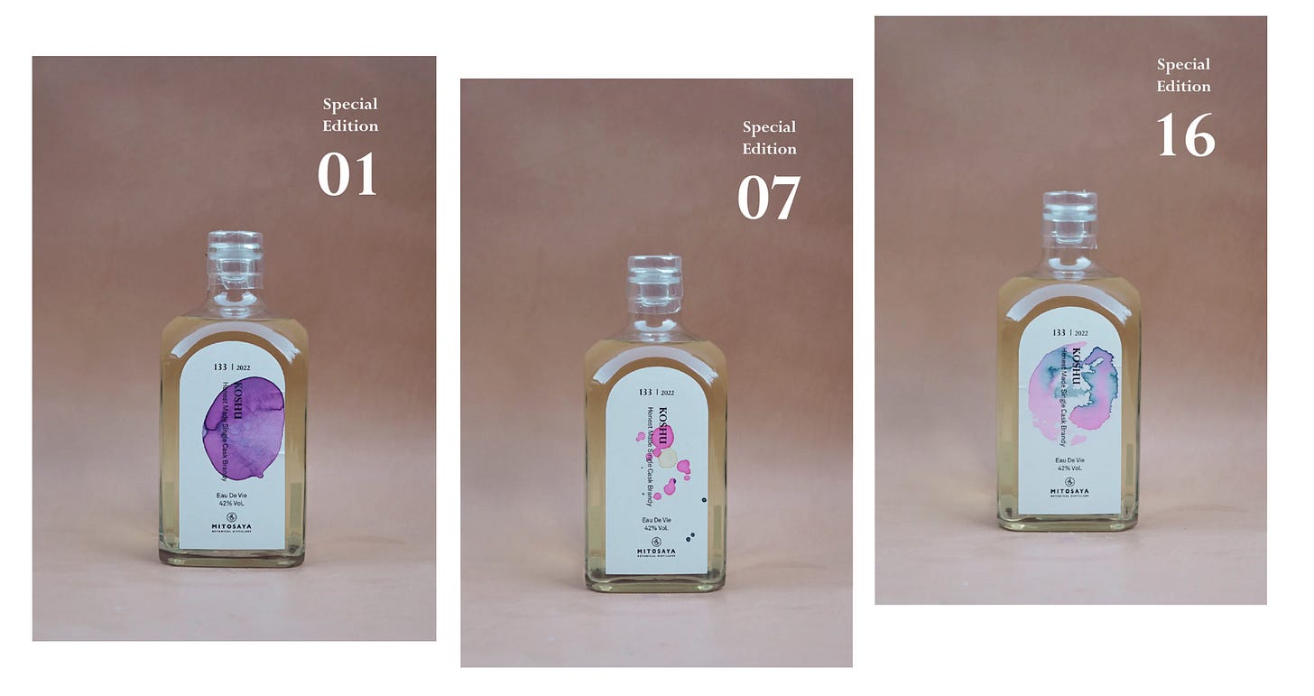
My last set of labels for the year was my idea. Something not printed but hand-inked so that each label would be different and buyers would get an original piece of art made with original recipe inks wrapped around their own bottle. This collaboration ends in a few days but it feels like a model for future collaborations: instinctive, open, productive, poetic, varied, magical, and down to earth. Which now that I write it sounds like the ingredients for the sort of new year ahead I would wish for all of us.
—JL
In the Colour Lab below I will share more and explain a deeper the actual ingredients that went into my thinking on the Koshu Project.
Keep reading with a 7-day free trial
Subscribe to The Colour | Newsletter | Lab | Community to keep reading this post and get 7 days of free access to the full post archives.


