


A Relationship in Pink and Grey
Fire, Poison, Italian Wine, Memory, and Colour

Color is life; for a world without color appears to us as dead.
Colors are primordial ideas, the children of light —Johannes Itten
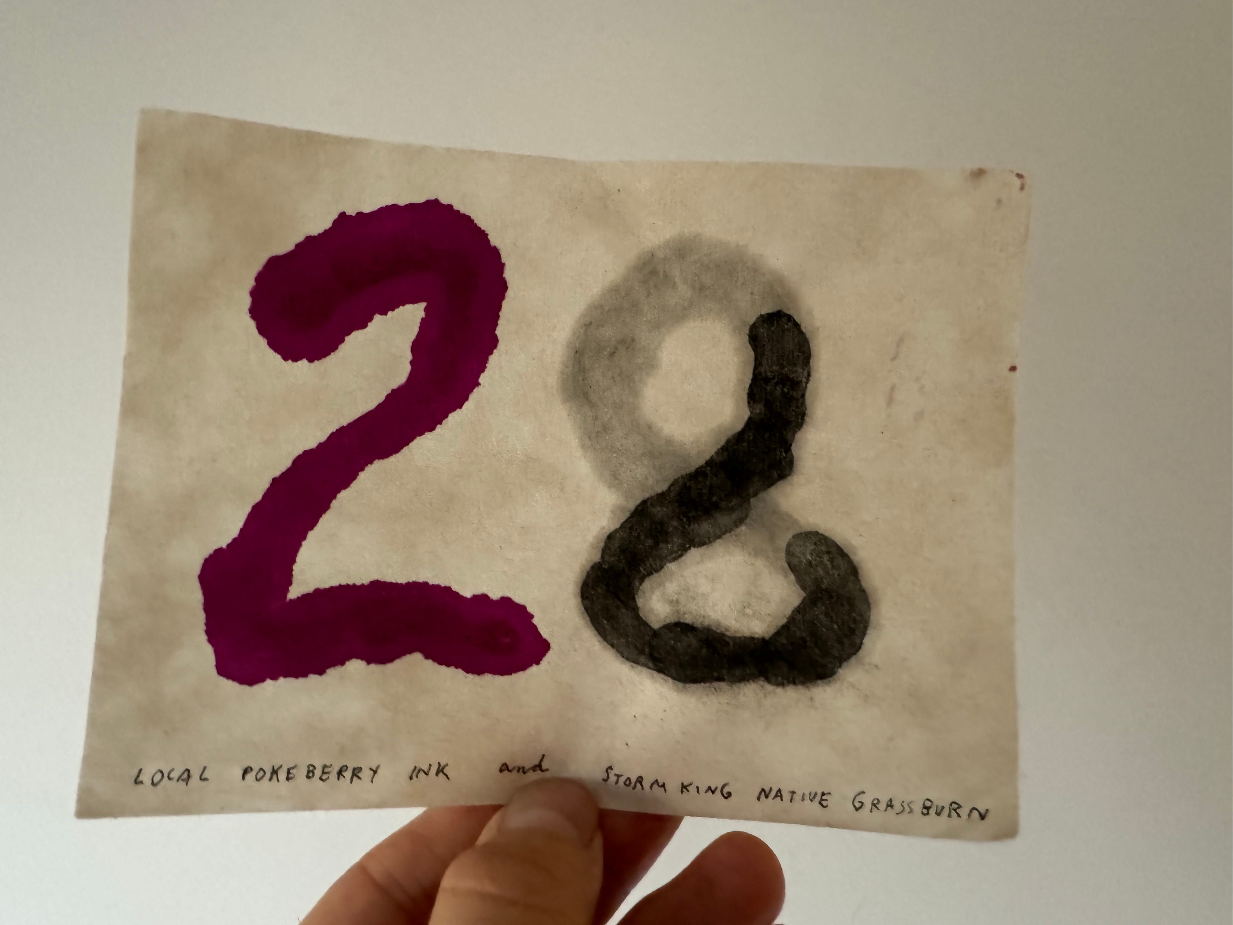
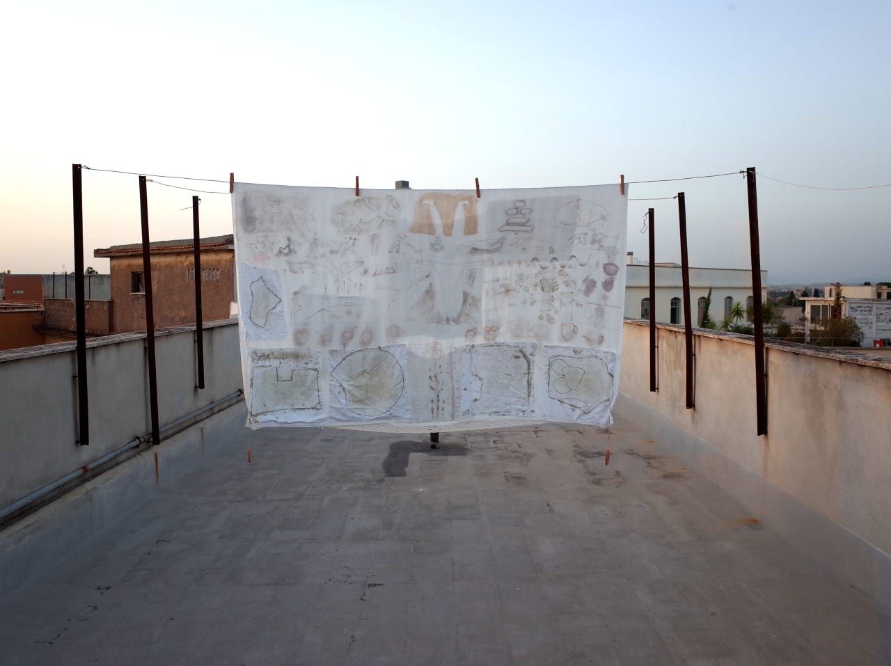
Happy birthday to Ellie who just turned twenty-eight. Okay maybe it was some weeks ago. Still, if you are reading this Ellie, I do have your birthday card (shown above). It was over a month ago that I made the card and promised everyone a story of pink and grey. But life intervened. The colour has not faded. And what is it about this little flag the letters made with my baby finger dipped into the handmade inks?

Contrast and Balance
What is it about pink and grey that make them feel so like partners? What makes any colour pairing feel right? Or somehow more complete? Maybe here it’s contrast. The bright magenta pink is the most shocking of colours and unwavering in its single textureless tone, and grey being the most calm of colours, in this case humming not with electricity but with grainy calm static in a range of frequencies. They have a totally different pulse but the same heartbeat. Together here to offer the eye and mind balance or as Johanne Itten would say, a colour harmony. I am not sure of the geometry of grey and bright pink on the colour wheel, but I know how it feels when something works. I know pink and grey always feel velvety, regal, balanced and storied. And there is of course to each ink, a backstory. And like every natural story this one splinters off in a few directions. One ink is made of everlasting rejuvenating fire the other from fugitive medicinal poison. They speak to each other.
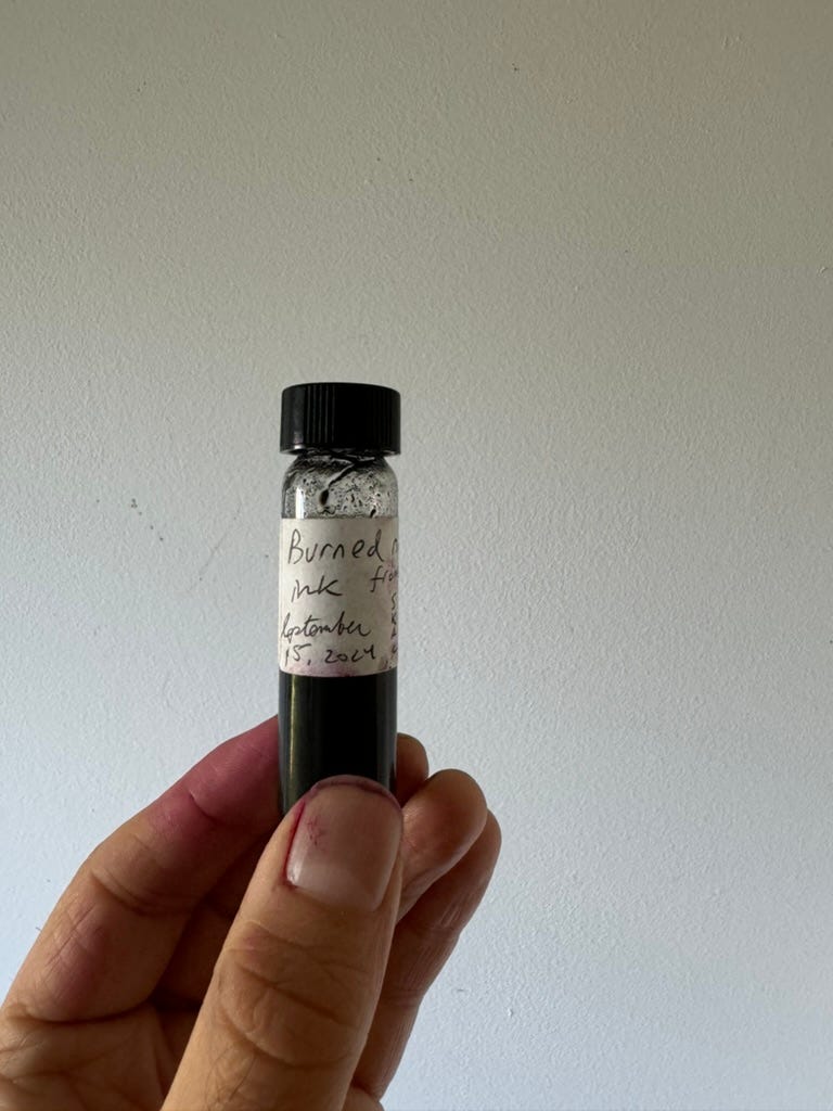
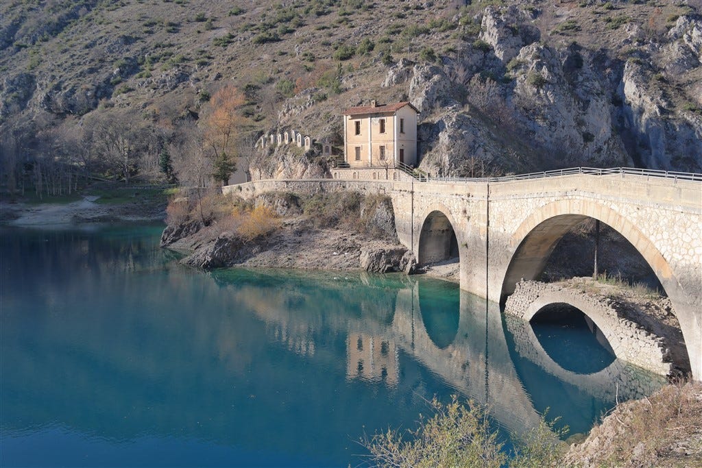
Grass Burn Grey made by an artist curator from a family of Abruzzese Restauranteurs
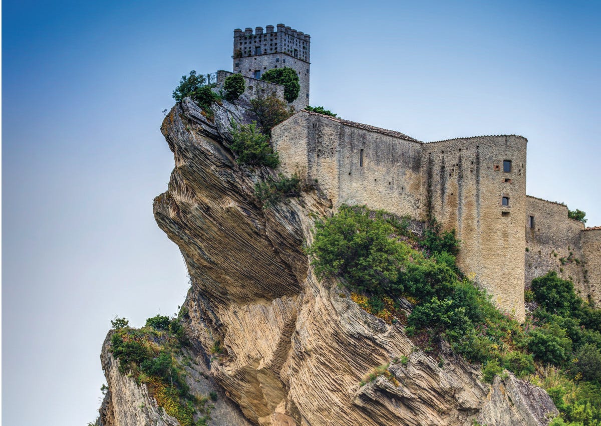
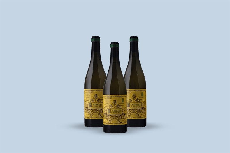
The speckelly grey is made of the ashes of the annual grass burn at The Storm King Art Center up the Hudson River an hour north of New York. As it turns out, some of the staff at The Storm King had been using my book to make ink for a while. Michael DiRosa made this ink from the charred remains of grasses at this outdoor sculpture park and sent me home with a tiny vial that I used on this little square of paper. Mike comes from a family of Restauranteurs from Abruzzo. I knew nothing about this part of Italy and after I tasted some of the wine, I couldn’t help looking up pictures of:
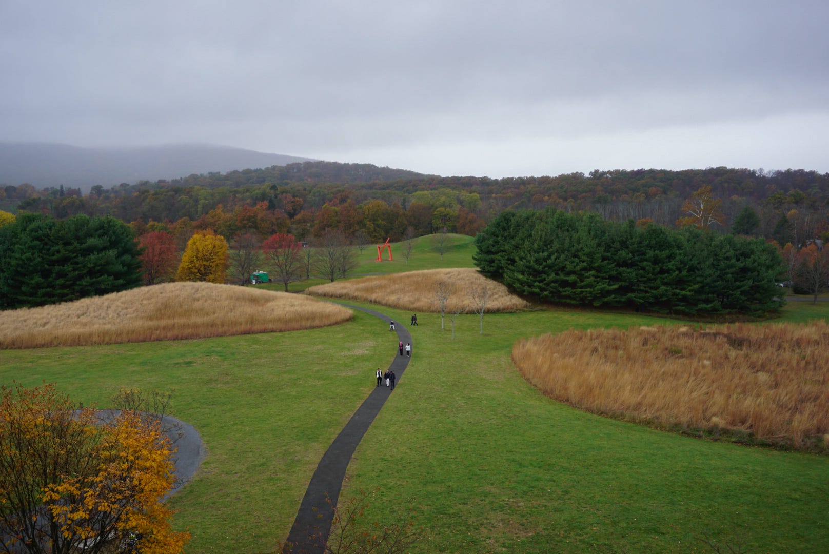
The Storm King Art Center
is maybe the most famous outdoor sculpture park in the world, and I felt lucky to be invited there. I think of it as wizardly because of its winding paths through forests and streams, backlit fields of flower and grasses, its brutalist elevator leading to a mansion on a hill guarded by old oak and black walnut. And looking over the whole estate from the hill in the morning, the hulking permanent installations feeling not so much grown out of the landscape but dropped down alien-like into it. Sculptures by Alexander Calder, David Smith, Mark di Suvero, Henry Moore, Douglas Abdell, Isamu Noguchi, Richard Serra, and Louise Nevelson. Statues that early in the morning with a bit of mist look like the remnants of some future civilization. Walking paths are shorn short and loop through the golden backlit grasses: Switchgrass and Big bluestem, Indiangrass (Sorghastrum nutans); Little bluestem (Schizachyrium scoparium); Purpletop tridens (Tridens flavus); Canadian wildrye (Elymus canadensis); and Sideoats grama grass (Bouteloua curtipendula). These grasses would be burned to pure char and ground and added to gum arabic and water mixed and bottled and made into something grainy grey and prickling with possibilities.
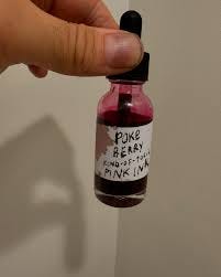
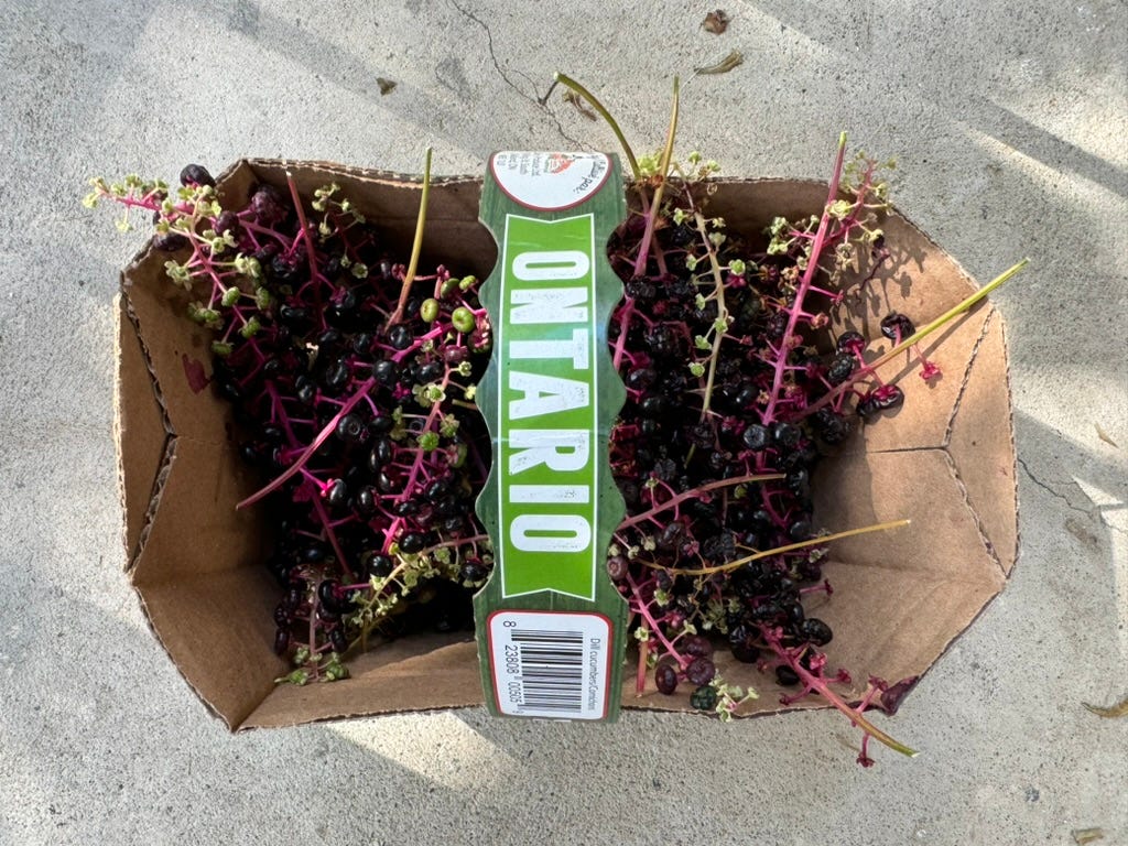
The Bright Pink Poison Ink
My friend Don dropped them at my porch …
Keep reading with a 7-day free trial
Subscribe to The Colour | Newsletter | Lab | Community to keep reading this post and get 7 days of free access to the full post archives.